Product page optimization: choose screenshot concepts before you A/B test
Choose App Store screenshot concepts with an audience survey, then use Apple product page optimization to test download conversion and interpret the result.

Research method
A researched guide informed by the Light Apps interview with Victor Babitsky published May 29, 2025 and current Apple documentation checked October 1, 2026. The guest’s reported results and survey sample size are attributed experience, not independently verified findings. NaviStack did not run the surveys or product page optimization experiments described. Worked examples are illustrative. Images are AI-generated explanatory diagrams, not actual App Store Connect screenshots; their key information also appears in accessible text and tables.
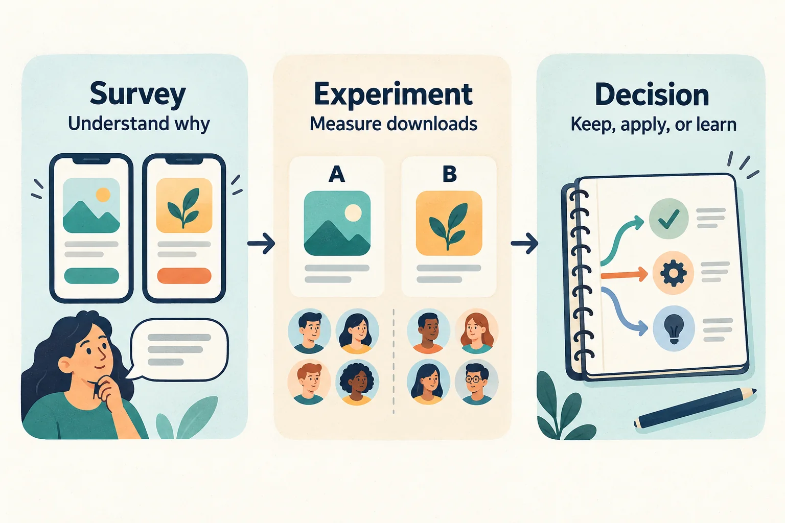
Choose a screenshot concept your intended users understand, then test whether it helps them download the app. A preference survey can explain what people see in a design. Apple's product page optimization gives you a separate way to compare download conversion on the App Store.
This guide connects those two jobs: use audience feedback to write a hypothesis, turn it into a screenshot treatment, and decide what the store test actually supports. It draws on a podcast guest's method and Apple's documentation, checked October 1, 2026. NaviStack hasn't run the experiment described here; the worked example and illustrations are hypothetical.
TL;DR
| Your question | Short answer |
|---|---|
| Which screenshot concept should you build? | Compare distinct concepts with relevant alternatives, then ask likely users what they expect and why they'd choose one. |
| Does a survey winner convert better? | A survey measures stated preference. Use it to choose a hypothesis for an App Store experiment. |
| What does product page optimization test? | Eligible iOS and iPadOS product pages can compare screenshot, preview, and icon treatments through random allocation. This guide focuses on screenshots. |
| When can you choose a treatment? | Review conversion, relative lift, confidence, and test status together. Early results and inconclusive tests don't establish a winner. |
| What should you record? | The audience, concept, reason for the change, exact assets, test settings, results, and next decision. |
Choose a screenshot concept by asking why
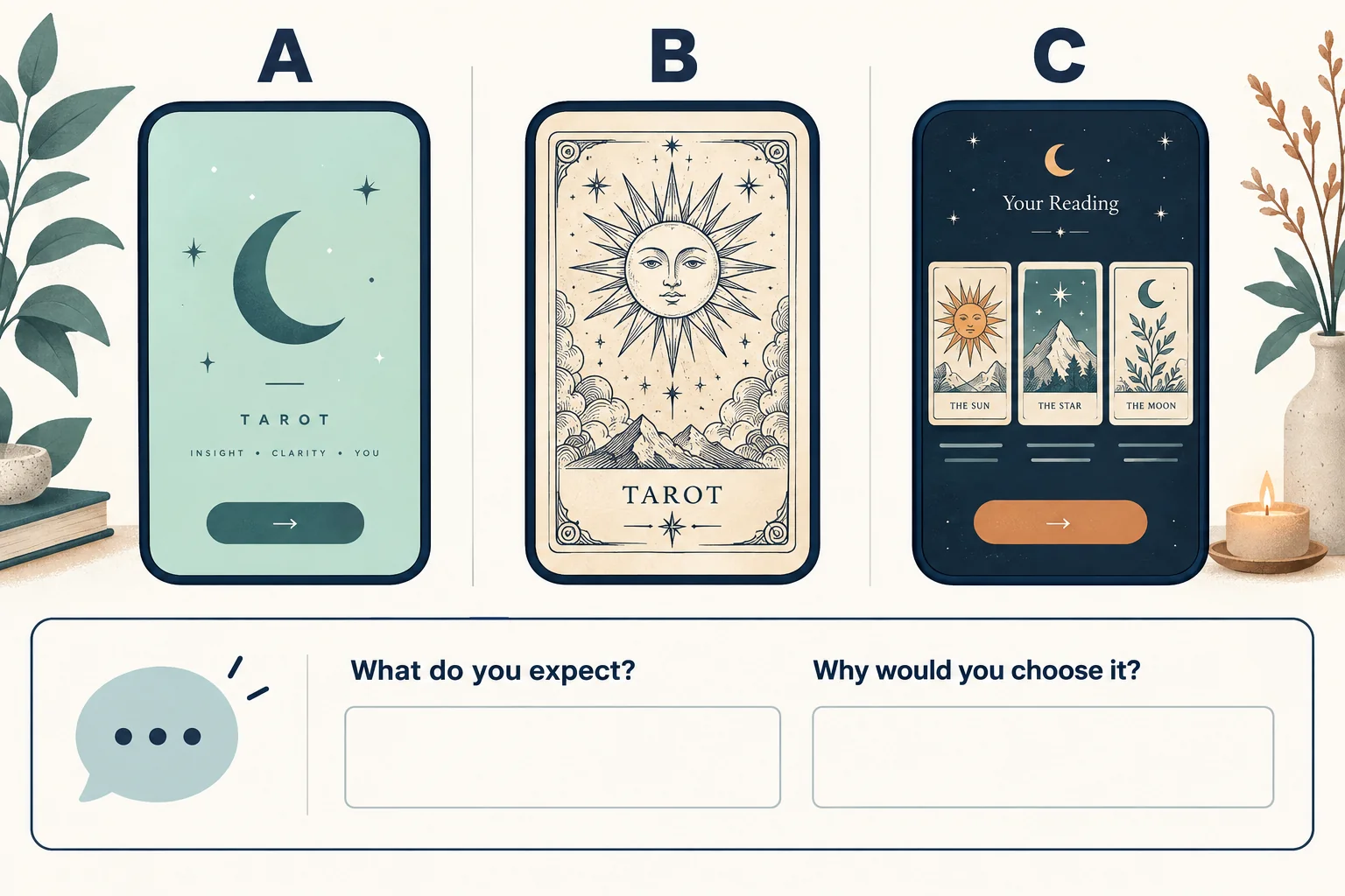
In the Light Apps Podcast episode featuring Victor Babitsky, the guest describes a tarot app whose more modern visuals missed audience expectations. He says surveys pointed toward older, rune-like imagery instead. His wider suggestion is to put your visuals beside relevant competitors and ask participants to explain their choices. Watch the episode.
That is a reported experience, rather than an independently verified conversion result. The episode doesn't supply the underlying survey data or a controlled result you can reproduce. The useful lesson is the question it raises: does your design communicate the category and experience the audience expects?
For your own survey, use this sequence:
- Define who should answer. Recruit people who face the problem your app solves, in the language and market you're designing for. Write down how you recruited them. Existing customers can explain the product; prospective customers can reveal what the listing fails to communicate.
- Choose a meaningful difference. Compare a category-focused design, a clear workflow, or a different benefit. Keep the product claims accurate. Small color variations are useful only when color is the question you need to answer.
- Create a fair comparison. Show concepts at the same size and quality. If you include competitors, select apps serving a similar need and record which pages you used. Rotate display order so the first option doesn't always get the same position. A competitor's placement or popularity alone doesn't prove that its screenshots caused success.
- Ask for interpretation before preference. Start with “What do you think this app does?” Then ask which you'd consider downloading and why. Follow up on unclear features, visual associations, and missing information. Record the actual answers alongside the choice.
- Turn recurring reasons into a hypothesis. “People like B” gives a designer little direction. “People recognize the reading format in B and understand the result they'll receive” suggests a specific change you can investigate.
Babitsky suggests roughly 50 respondents can be enough for this kind of concept research. Treat that number as his experience, not a validated sample-size rule. Audience fit, recruitment, and the question affect what you can learn. Fifty preference votes don't establish a conversion lift or represent every App Store visitor.
Finish this stage with one reasoned concept and a written hypothesis. Keep minority answers that expose confusion; a popular design may still create the wrong expectation.
Set up the screenshot experiment in product page optimization
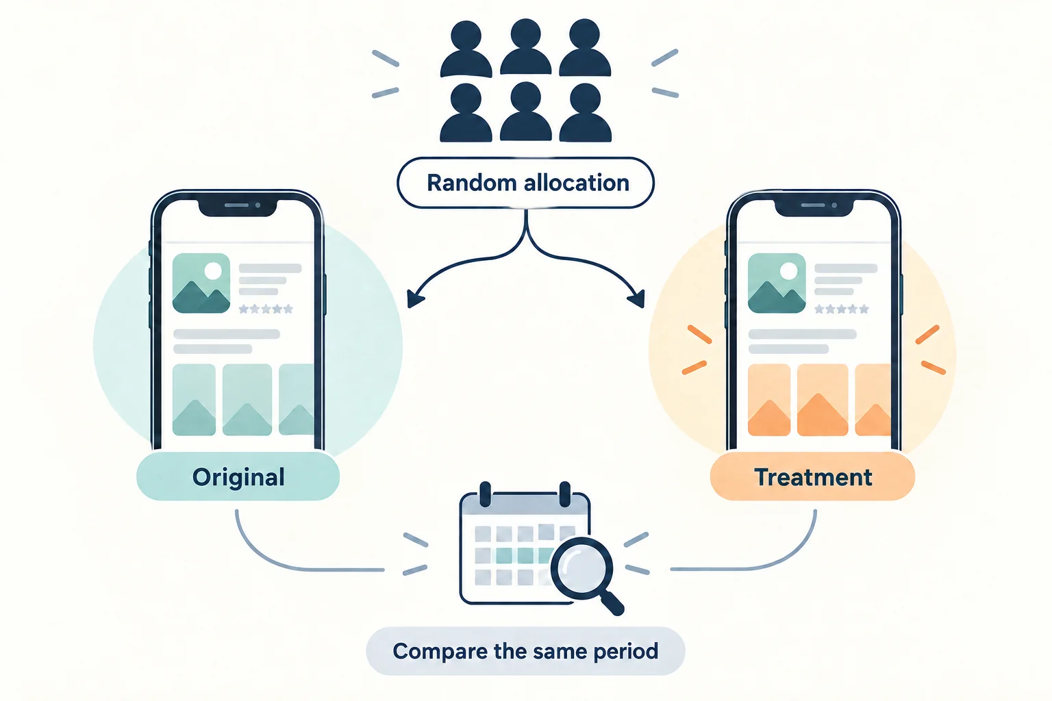
Apple's product page optimization is a native App Store testing feature for iOS and iPadOS. It randomly shows variants to users and compares their performance. For the live-app workflow here, confirm your app is in Ready for Distribution as Apple's overview requires. Treatments appear on iOS 15 and iPadOS 15 or later. These tests don't apply to custom product pages, Apple Watch product pages, or iMessage product pages. You need the Account Holder, Admin, App Manager, or Marketing role. Apple's overview.
Prepare accurate screenshots for the device sizes and localizations you intend to test. New treatment assets need App Review approval. Screenshot metadata can be submitted without a new app version; merely reordering already approved screenshots doesn't require resubmitting them. Check every device tab: unchanged sizes use the original page's assets. Configure test treatments.
If you need to produce mockups from your actual app screens, the NaviStack screenshot generator can help prepare them. It doesn't choose your hypothesis or run the experiment.
For a focused App Store A/B testing workflow:
- Write the test question. Specify the screenshot change and the reason you expect it to affect download conversion. Keep the icon and preview unchanged so the comparison remains about the screenshot concept.
- Create the test in App Store Connect. Select your app, open Product Page Optimization, create a test, and give it a reference name you can recognize later.
- Choose treatments and traffic. Apple allows up to three treatments. One treatment is a useful starting choice when you have one hypothesis. The traffic proportion refers to traffic allocated across treatments; remaining traffic sees the original.
- Select localizations deliberately. Match them to your research. Check Apple's duration estimate against your available traffic and desired improvement. Its setup guidance caps a test at 90 days and warns that your desired improvement may remain unresolved within that time. Create a test.
- Upload and review the assets. Confirm filenames, order, device sizes, localization, and unchanged elements. Keep a copy of the original set.
- Start the approved test and check its status. Use Start Test; if assets still need approval, follow the review submission flow. Confirm the status shows Running. Results begin appearing after five first-time downloads associated with the test. That threshold makes results visible; it doesn't make them conclusive. Run a test.
Keep a log of app releases and marketing changes during the test. Apple warns that a version release can affect results when it changes the assets or metadata being tested. Schedule your test around those changes when possible.
Worked example: turn tarot feedback into a testable change
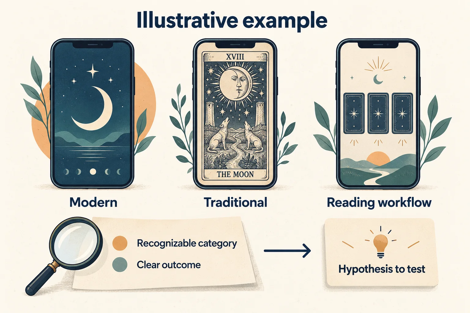
Imagine an app that lets someone choose a tarot spread and read its interpretation. This is an illustrative exercise, separate from the podcast guest's app.
You prepare three concepts: A emphasizes minimalist moon artwork, B emphasizes familiar card illustrations, and C shows the sequence from choosing a spread to reading an interpretation. You include relevant competing listings in a private research comparison.
Suppose the responses suggest that A looks attractive but leaves the task unclear. B helps participants recognize the category. C makes the workflow easier to explain. Those are hypothetical findings, not survey results collected by NaviStack.
The next design could combine recognizable card imagery with an honest preview of the reading workflow. Write the hypothesis before producing the final treatment:
Showing familiar card imagery alongside the reading workflow will help prospective users understand the app and increase download conversion compared with our current screenshot set.
The experiment then compares the current set with that new concept, keeping other tested elements unchanged. Because several screenshot details change together, a positive result would support the combined concept for the tested traffic. It wouldn't isolate the effect of the artwork, headline, or screenshot order.
If you need to learn which detail matters, use a later experiment with a narrower change. Choose that follow-up because it answers a remaining question, rather than generating variations indefinitely.
Read the result before replacing the original
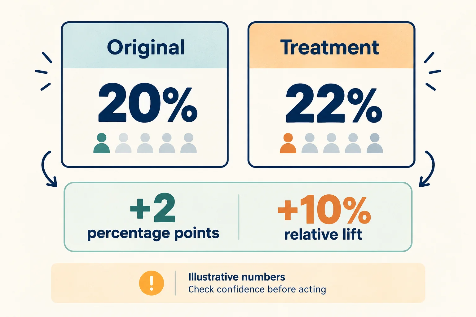
Open your app's Analytics tab, then Acquisition → Product Pages and the test. Review the original and treatment together: exposure, estimated conversion rate, estimated relative lift, confidence, and status. Apple labels treatments Performing Better or Performing Worse when they reach at least 90% confidence. Collecting Data and Likely to be Inconclusive require a different decision. Apple's results guidance.
Keep percentage points separate from relative lift. In a hypothetical comparison, moving from 20% conversion to 22% is an increase of 2 percentage points, or 10% relative lift: (22 − 20) ÷ 20. Those numbers explain the calculation; they are not a result or expected improvement.
Choose the action that the evidence supports:
- Performing Better: consider applying the treatment after checking the test scope and whether the screenshots still represent the app accurately.
- Performing Worse: retain the original and revisit the hypothesis. Survey preference can fail to translate into downloads.
- Collecting Data: keep observing within the test window. A higher displayed rate by itself doesn't establish a winner.
- Likely to be Inconclusive: record the uncertainty. Consider a more distinct, credible concept or a later test with sufficient traffic; don't report “no effect” as a proven finding.
Before applying a treatment, save the original assets and the test record. Apple's Apply Treatment action can't be undone, and applying during a running test stops it. Use Apply Treatment to Current Product Page only after deciding to make that change. The action applies screenshots and previews; changing the default icon follows a separate app-version workflow. Apply a test treatment.
Download conversion is only one part of the app's performance. Continue reviewing activation, retention, and purchases through your product and billing records. Our app marketing guide connects acquisition to those later outcomes.
Keep a worksheet for the next decision
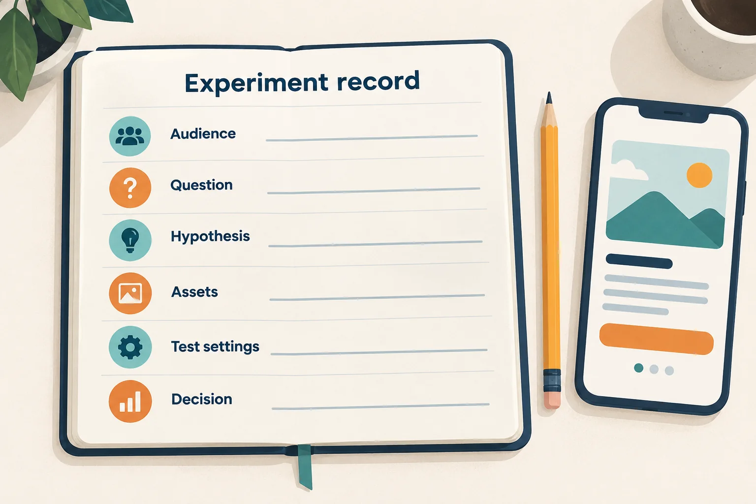
Copy this table into your working document. Fill the first six rows before launch, then add the results and decision. It keeps a promising survey observation from becoming an unsupported performance claim.
| Field | What to record |
|---|---|
| Audience and recruitment | Who answered the survey, language, market, how they were recruited, and gaps in representation |
| Comparison material | Your concepts and the relevant competing listings, with dated references and display order |
| Feedback | Choices, participants' actual reasons, confusing elements, and contradictory answers |
| Hypothesis | The change, why it might help, and the outcome the experiment should evaluate |
| Assets | Original and treatment filenames, screenshot order, device sizes, localizations, and unchanged elements |
| Test settings | Reference name, traffic proportion, localizations, approval status, start date, and review checkpoint |
| Results | Exposure, estimated conversion, relative lift, confidence, status, and changes that may affect interpretation |
| Decision | Keep the original, apply the treatment, or investigate another question; include the evidence and remaining uncertainty |
The next useful screenshot is the one that answers your next question. Keep the explanation from the survey and the evidence from the App Store test attached to the decision.
Keep reading
More practical guides and comparisons selected for this topic.
GuidesApp growth
How to market an app after building or buying it
A step-by-step mobile app marketing strategy: research customers, build your offer, create ads, launch a test, and measure acquisition costs and retention.
Read article
GuidesApp monetization
App subscription launch checklist: interactive tool
Build a tailored iOS and Android subscription release checklist, track evidence and progress, export the results, and generate an AI code-review prompt.
Read article